The overview and nitty-gritty bit of Tableau
in Blog
To facilitate the discovery of data insights or the monitoring of a model forecast, Tableau is one of the options that can help you quickly prototype an interactive dashboard. While it is not free, if your company does procure its license, it’s a no-brainer to pick up this skill due to its vast usefulness.
As a Tableau beginner myself, despite everything is one google away, I often caught myself scratching my head when I first started due to the lack of understanding of what Tableau has to offer, hence the right keyword does not pop up at first try. Given that, I believe a run-down of Tableau’s essential concepts may benefit readers in approaching their first dashboard systematically and steer them in the right direction. Hence the writing of this topic.
A dashboard development typically consists of 3 stages: Connect, Analyze, and Share. The post is organized in a similar manner, plus an introduction of Tableau’s interface and high emphasis on Analyze section because most development works happen there. It’s noteworthy that there is a shift in calculating mindset, should the developers mostly use Python in their daily job. The impression that there is little room for sophisticated logic implementation can be clear up when you adopt the mindset of column-based calculation, which is much similar to working with Excel. Keep in mind though, at the end of the day, Tableau is a visualization tool and not a data processing engine.
Once reaching the end of this post, my objective is the readers are equipped with the ability to sketch your dashboard implementation in clear and deliverable steps, and know what to look up to implement your dashboard at details level. You may find some part not relevant at first and do feel free to skip it. What matters is capturing the flow of a dashboard life cycle!
Navigation
Launching the software for the first time, you will find yourself in the Start page. Here you can either connect to a data source (Data Source page), or jump right into the Workspace to work on an existing workbook. The two formers can switch back and forth using the Sheet tabs on the window’s bottom left.
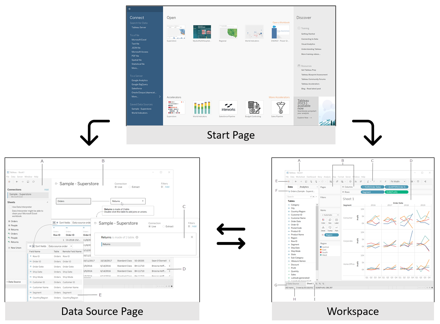 Fig. 1. The navigation flow between three pages developers commonly work on: Start page, Data Source page and Workspace. Source: https://help.tableau.com/
Connect
Tableau can connect to a wide range of data sources, including file-based (e.g., .csv, .json, Excel, text file), SQL databases, and Hadoop-compatible file formats like Parquet and Hive tables. For beginners, it is easiest to convert mock data into a .csv file and connect to it. Once the drafted workbook functions well, you can easily switch to the original data source to display live data.
Tip | Replace data source: If you have an alternative dataset with the same schema, you can switch between them without rebuilding the workbook from scratch by right-clicking on a field in the dataset’s attributes, selecting “Replace References…”. If there are differences in column names in some cases, you need to provide a 1-1 mapping for those.
Figure 2 captures the overall look and basic interactive components to whom you need to pay attention to.
- The Connection tab displays the selected Excel data source, and its multiple sheets are displayed if applicable.
- The Database icon allows to switch the view of datasets.
- The Schema section shows the column name and data type of the selected dataset, along with 1000 rows of examples. You can rename the field name. Icons like Abc or # indicate the field is discrete (e.g., country names in flight records) or continuous (e.g., transaction prices in supermarket records).
- The Extract mode determines how data is retrieved from the source. A “Live” connection retrieves all the latest changes, which is often preferred for dashboards that go live. I recommend opting for Extract mode during development to trigger data retrieval only when needed, working with static data. I set Extract with a CRON job (time-based scheduler) because I found this setup to be more stable.
Tip | Refresh and Extract: Extract refers to retrieving data, and Refresh refers to reloading the entire workbook. If your dataset is updated, you should ensure that the Extract is triggered, either manually or automatically, to reflect the changes.
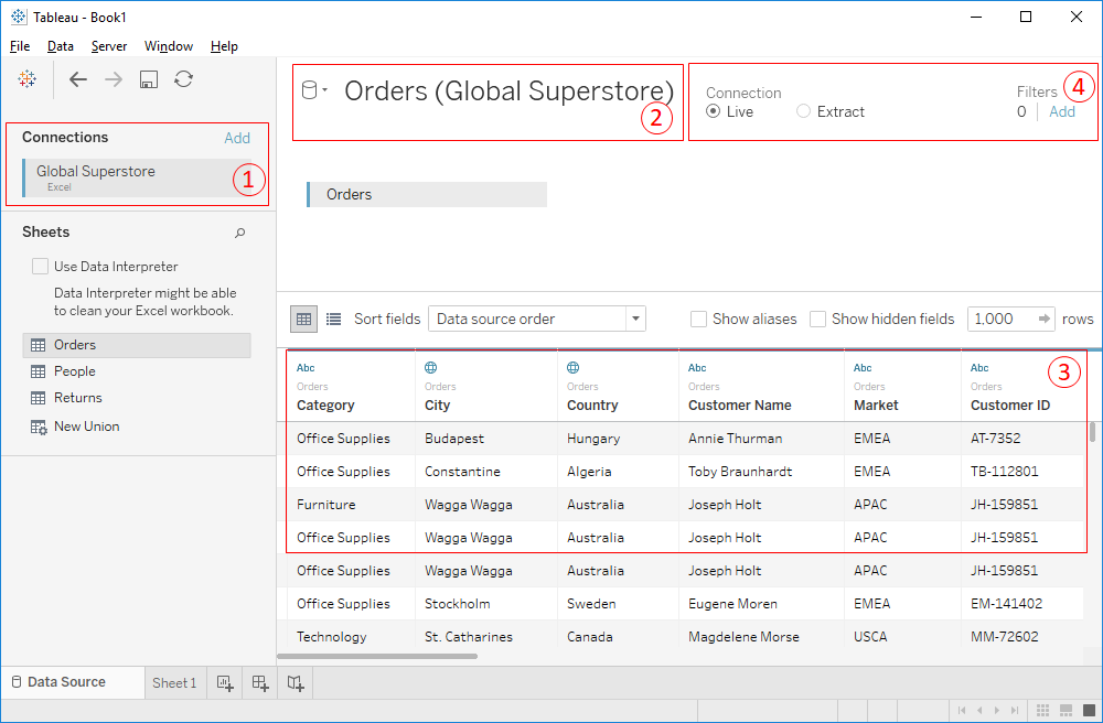 Fig. 2. Data Source page’s interface. Source: https://interworks.com/blog/rcurtis/2018/01/31/tableau-extended-data-connection-page/
In addition to the above, you can also join two datasets to create a third dataset with more meaningful information. You can create a user-defined calculation or copy of another field, displayed with an equal sign (=) preceding an icon. More on this topic will be discussed in the Analyze section, but I find the Custom Split feature to be commonly used for splitting full names into family and given names.
Lastly, you can save data source in two formats. The .tds file does not contain data from underlying source, but your modification and connection info you have added. The .tdsx file contains the info of .tds file, plus a local copy of the data, in case your colleagues do not have access permission to such data.
Analyze
Workspace
The workspace in Tableau serves as a canvas where you can create visualizations using fields from the Data Pane. You can add these fields to the Worksheet by dragging and dropping them directly, or indirectly into the Columns/Rows Shelf and Marks Card. To help you choose the best chart for your data, Tableau offers the Show Me button, which suggests suitable chart options based on the selected elements. Additionally, you can customize your charts using the Marks Card and Filter Shelf. Figure 3 illustrates other common components.
Tip | Right Click: When you need to perform a specific operation on a component within the workspace in Tableau, try right-clicking on the object. Many times, the action you are looking for is already available in the context menu that pops up.
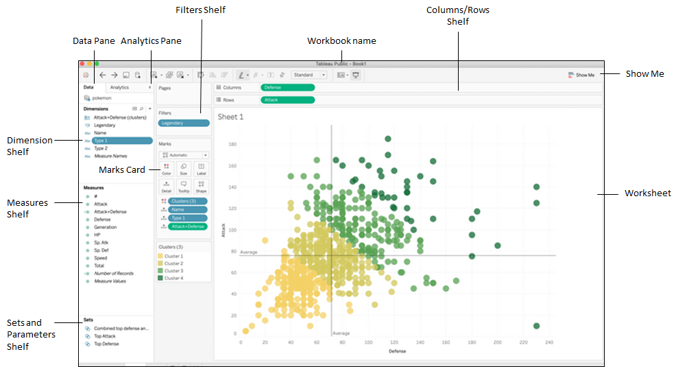 Fig. 3. Workspace’s interface. Source: https://www.reddit.com/r/tableau/comments/fsajiw/pls_help_with_pokemon_scatter_plot/
Data Pane
Tableau categorizes dataset fields into different types to help organize and analyze data. Here’s a breakdown of each field type::
| Field | Definition |
|---|---|
| Dimension fields | These are categorical variables that contain qualitative information like text and dates. They determine the level of aggregation for numeric data. |
| Measure fields | These are numerical variables that contain numbers. They can be aggregated to provide summarized data. |
| Calculated fields | These are new variables that are derived from existing fields. They can be thought of as formulas similar to those in Excel and are represented by an equal sign (=). |
| Sets | Sets represent subsets of data that meet certain conditions based on existing fields. They are useful for highlighting key data points, combining fields, and displaying ins and outs of a set. They are particularly effective for point-based charts in anomaly detection. |
| Parameters | These are variables that act as constant values. They allow for control over the view in some way. |
In the example of the hourly traffic records, the schema can be interpreted as follows:
| Column Name | Data type | Description |
|---|---|---|
Date | Dimension field | Timestamp in the format DDMMYYYY. |
Vehicles | Measure field | Number of observed vehicles. |
Max(Vehicles) | Calculated field | Maximum value of Vehicles in an hour. |
Vehicles(<1000) | Set | Set of data points where Vehicles is less than 1000. |
SelectedDate | Parameters | Can be today or a specific date of interest. |
It’s worth noting that fields can be converted between dimension and measure, depending on the context. For example, if a measure field has a fixed set of values, such as a Gender field with Male=0 and Female=1, it can be directly converted into a dimension. However, it’s not possible to directly convert a dimension field with text values into a measure. Instead, you can use a calculated field to perform mathematical operations, aggregations, or other transformations to effectively turn it into a measure. For example, a CharacterCount derived from UserReview in a product review dataset.
To structure fields systematically, you can also create a Hierarchy to capture their relationships. Tableau typically captures Date as a hierarchy representing different date parts (year, quarter, month, day) at different aggregation levels. Users can treat them as continuous or discrete variables, depending on their needs, to suit their specific analysis.
Tip | Date part vs. Date value: The two properties of the
Datefield in Tableau can determine whether it is treated as discrete or continuous. This can sometimes be confusing, so it’s work taking a closer look. You can find a detailed explanation on this page.
Chart Creation
When creating a chart in Tableau, you start by dragging fields from the Data Pane to the Columns & Rows Shelf to define the x-axis and y-axis. The type of field (discrete or continuous) and its aggregation level determine how the chart is populated.
The Marks card allows you to customize the appearance of data points in the chart, including shape, color, size, label, detail, and tooltip. If you want more control over the displayed data, you can add filters to condition the data points, such as showing data from the recent 2 weeks.
Another approach is to reverse-engineer by exploring different chart options and finding the right combination. The “Show Me” feature is helpful in suggesting the best practice chart based on your selected fields. Interestingly, the most common chart I’ve encountered in dashboards is the basic Crosstab chart, or sometime called a Pivot table or Text table. This type of table allows you to drill down to row-level detail, supporting other charts or serving as a practical starting point for data analysis.
When you combine two fields into an axis or create a dual-axis view, Tableau generates additional fields called Measure Values (dimensions) and Measure Names to help organize the chart values and labels. In a dual-axis view, you may need to manually sync the scales between the two axes by right-clicking and adjusting the properties.
To enhance the storytelling aspect of your chart, utilize tooltips to provide contextual information, e.g. rewording, in a more natural and engaging way. Filters can be used to easily limit the range of values displayed in the chart.
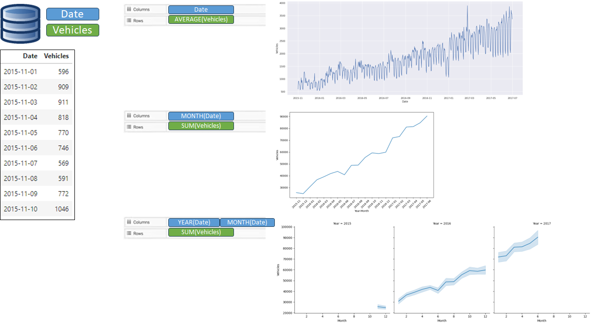 Fig. 4. Illustration of how charts are created on the Fields dragged into the Rows and Columns Shelf, considering their continuous and discrete nature.
Analytics Pane
If you have a chart already created in Tableau, the Analytics Pane provides convenient options to add predefined components like constant and average lines, medians with quartiles, box plots, and totals to enhance the chart.
Additionally, for line charts, you can find trend and forecasting models such as trend lines, forecasting, and average distribution bands within the Analytics Pane.
Computational Mindset
Often, the existing data may not contain the key measure you want to display in the chart. In such cases, consider adding a new field to the original data source, or explore Table Calculations to dynamically respond to your visualization’s layout and partitioning, providing pre-computed aggregations and running totals. Alternatively, if you prefer a more customized approach, the Calculated Field feature in Tableau is another solution and will be the focus of this section.
For those who are primarily accustomed to using Python, transitioning to Tableau’s computational mindset can be challenging at first. Instead of writing code to transform the data, think of handling it similar to an Excel file. To compute a sophisticated column, break down the logic into step-by-step and use multiple fields to capture them, providing a complete Excel-like experience with formulas.
Here are some best practices I’ve learned along the way:
- Be mindful of NULL values. Crosstab will not show data rows with NULL values. You can use the ZN function to replace NULL with zero (0).
- When referring to a constant, make use of Parameters. These are defined values not specific to the data source or worksheet, allowing users to have input control over the visualization across the entire workbook.
- Level of Detail (LOD) expressions define the granularity or aggregation of the data in your view. They are useful to avoid potential misleading when aggregated, and include keywords such as Fixed, Include, and Exclude.
- Consider performance: Calculated fields are processed on the database side, while Table Calculations are processed locally.
Troubleshooting
First and foremost, your best friend in Tableau is View Data. When you come across a visualization element you are unsure about, simply highlight it and right-click to select “View Data”. You can view the data that constructs the chart, the pre-filtered data, or even export it to a file for a closer look.
Secondly, bugs can often be found in the logic of Calculated Fields. By clicking “Edit” on the Calculated Field, you can examine the formula and identify any issues. In one instance, I encountered a situation where I didn’t have any filters turned on, but a data row was missing. After investigating the calculated field, it turned out that the formula didn’t return a value for that particular row due to a value check condition.
Dashboard & Worksheet
Within the Tableau Workspace, the sheet tabs located at the bottom left offer easy access to switch between the Data Source page, Worksheets, and Dashboards. A worksheet represents a single chart creation, while a dashboard combines multiple charts into one layout, providing an end-user view. The views in a dashboard are connected to the worksheets they represent. Any changes made to a view, either directly on the worksheet or within its dashboard representation, are reflected accordingly.
A recommended approach for structuring your dashboard is to utilize Layout containers to define the layout orientation. The tiled component can effectively organize charts and dynamically fit the entire view within the container to minimize extra space. Different fit modes such as Entire view and Standard can be chosen based on your requirements. If multiple sheets or objects are placed in a horizontal or vertical layout container, enabling Distribute can help maintain alignment. On the other hand, floating components allow for layering containers/charts on top of each other, creating a close proximity look.
Additionally, it’s important to ensure that all charts have titles. You can further customize the dashboard using non-worksheet objects like text, images, and web pages. When two charts share the same filters, consider removing one and syncing both to the same filter. Aligning these charts row-wise or column-wise provides a visual cue that their selected data is interconnected.
Tip | Copying dashboard to a new worksheet: When transferring specific dashboards from one workbook to another, you can avoid rebuilding them from scratch. Simply right-click to copy the desired dashboard, navigate to the new workbook, and paste (Ctrl+V for Windows).
Share
Once your final work is saved and ready to share, you have two options:
- Share the Packaged Workbook (.twbx file) containing the dashboard along with supporting data to individuals who do not have access to the data or a Tableau developer license to view it.
- Alternatively, publish/upload the workbook to the Tableau server and share the URL.
Tip | Hiding all worksheets: When publishing the workbook to the server, each worksheet becomes a visible tab as an individual view. Therefore, it’s advisable to hide all unwanted worksheets to avoid confusion.
Workbooks are highly reusable, and new data can be added on a daily basis. From the Tableau server, you can set up a CRON job to periodically extract the latest data batch. Additionally, you can subscribe yourself to another CRON job to receive an email at a specific time of the day, automating the entire process.
Summary
By correctly naming all the elements in Tableau, you can consider the creation of your desired dashboard as halfway accomplished. It’s likely that your chart has been created before, and finding a reliable reference will enable you to replicate it. I hope that this tutorial provides a quick reminder of Tableau concepts and is beneficial for your work.